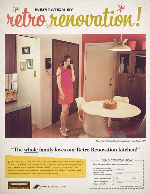
 Woah. This may be the bestest thing ever on the blog yet: Readers Rebecca and Keith not only did an amazing job remodeling their 1960s kitchen in appropriate mid century style — but this creative pair has marked the event by designing a back to the future advertisement — worthy of Mad Men — designed just for us. Woah. Keith and Rebecca are co-owners of a design company, Woodhouse Creative, and they sure are! Of course — their new kitchen is just as delightful as the surprise ad – Rebecca sent lots of photos of their kitchen, which was transformed from a spare white room into a warm, inviting retro-tastic space.
 We’ve featured Rebecca and Keith several times before. Here’s the first story we did about their 1961 split level house.
That first story was in 2009 — demonstrating that, yes, it takes time to gear up a kitchen remodel. In fact, pretty much our number-rule in planning a kitchen remodel is to wait at least one full year so that you can get to know your space and your taste (unless, of course, there are environmental and/or safety issues that need to be dealt with stat.)
Rebecca writes:
Hi Pam,
Here are my kitchen photos, finally! This seems very long, but there are so many important details and stories. I can’t decide how to trim it anymore. At the end is a very fun surprise. Luckily for me, my husband is a graphic designer and totally into this kind of thing. Months ago, you said something about a couple knowing how to do it. They had dressed up to take their photo in their living room. It took me ages to do it, but I got my hair and make-up done for it. Now I can forever be alive, in my dreams, in the 60′s.
![:)]()
“Now I can forever be alive,
in my dreams, in the 60′s.”
My dream of a new retro-style kitchen has been realized. The contractors missed the deadline by seven months and I was literally three days away from having a baby, but still didn’t have a working kitchen!
Our 1961 tri-level had an all-white kitchen with original cupboards that had been covered with white laminate. There was a wall with old pegboard that looked awful. They made some changes to sell the house which just left it void of character. The drawers left sawdust in my pans. It was also poorly-designed in that if someone was at the refrigerator you couldn’t walk around the counter to the rest of the kitchen.
But the worst part was the ceramic tile on top of concrete slab. It was so hard to stand on that it gave us leg and back aches. It was also really cold. We were expecting a baby in late July, and I had to have it redone. I knew if I didn’t do it before the baby, it could be years. So, I spent my very pregnant months making food in a three-season porch and doing dishes in a laundry room. And now that I have a child, we spend so much time sitting ON the kitchen floor playing, plus it seems like we spend all of our time in our kitchen. I am so happy we were able to swing it.
I wanted a Brady Bunch kitchen with orange counters, but my husband was very much against it. We both love 1960s Scandinavian design and we have a lot of Danish Modern furniture throughout the rest of the house, so this is perfect. And, I got my orange in on the wall and cushions!
I chose laminate counters for the look and the price. It’s Arborite Tatami. We really like the pattern and think the blue matches everything nicely.
The cabinets are Walnut and custom-built. I love the grain, it took my breath away the first time I saw it! And, I really liked using a local man, not a big company.
The ovens, refrigerator, and hood are Whirlpool for Ikea. I like the simple design of them and the price was nice especially with a great sale. The refrigerator is the counter depth Nutid, thanks to Pam. I love the hood and it works very well, actually. It’s called the Lutftig Hoo, which sounds so funny to me.
I really like having the stovetop apart from the oven like all the ads I spent hours studying on Retro Renovation and on Flickr. Besides the hood, I would not recommend the Ikea appliances unless you absolutely can’t afford better. They have redesigned the refrigerator since and maybe the water leaking issue on stainless steel isn’t a problem anymore. But it’s slowly killing me and I will have to replace it one day.
I asked our designer to put legs on the wall cabinet-piece after seeing a photo from a 1960′s kitchen where the cabinet was raised with metal legs.
My Mom made us the curtains. It was a hard choice because we love a very clean look. But everyone had curtains in the 60′s and they are warm and useful. I found the fabric at the same store that I found the orange vinyl. I love the linen look. It looks period-appropriate to me.
We love the new cork floor. I think it’s the best material for a kitchen floor for standing, and because things don’t break when dropped (or thrown.) It’s beautiful and warm, even in the middle of the night, in the winter with bare feet. And I think it looks really nice in the entryway, too.
From Rejuvenation, is the light I longed for. Thanks again to Pam, and this blog, I have what I think is the coolest light ever. Pam had a feature after visiting the Rejuvenation warehouse. Pam had a photo of a woman holding this light. I saw it and called them immediately and asked if I could have it! They had ten of them in their warehouse. After I saved up for it, they refurbished it and cut it to my specified length.
The pulls are the Peg Cabinet Knob from Rejuvenation.
After having the Ikea stovetop for a while, we sold it and bought an induction cooktop. Cleaning those gas stovetops is just too much of a pain for us and it wasn’t holding up well either. The GE cooktop is amazing, incredibly efficient, modern-looking, and cleaning it is a breeze. We highly recommend it.
Eero Saarinen is amazing to me because of his tulip table and chairs, and the St. Louis Arch. I am so happy to have those works of art in my kitchen every day. And sitting on them is a joy. To me, there was no other table I could have. I found four Knoll Saarinen tulip chairs from 1973 on craigslist. They were structurally in good shape, there were no cracks, but the finish on them had worn through. And of course they looked their age. The cushions were ripped and scratched and looked awful. I had the idea to take them to an autobody shop since they are fiberglass. The shop in town did an excellent job repainting them. (I can’t believe I forgot to take before photos!!) Apparently, I ruined their resale value having them painted, but I won’t be selling them anyway. I had the cushions reupholstered in an orange vinyl as close, as we could see, to the “carrot” that Knoll still makes them in. I didn’t have the time or will to find a used table, and it was too hard to find the right size. Therefore, I bought the table new from Design Within Reach.
The backsplash tile is from Ann Sacks. Keith and I saw it in Miami’s Design District, two years before we bought it, and took a photo just because we loved it. I didn’t think the day would actually come when I could USE it. I love that it’s designed by, and supports, an artist.
I love my toaster. We vacillated about it for an entire year, I think. I just couldn’t stand how awful a lot of new toasters look. They just didn’t match. And, I didn’t want to buy anything made in China. My husband finally gave me the go-ahead to get one from Toaster Central after he read many bad reviews of new toasters. So, it’s American made, 1974, and groovy. My beautiful blender is 1961, the same year as our house, and works like a dream. It’s from ebay, along with the rotary dial wall phone. Certain colors go for much less than others. Luckily I love brown!
 My dream of a new retro-style kitchen has been realized. The contractors missed the deadline by seven months and I was literally three days away from having a baby, but still didn’t have a working kitchen!

 Our 1961 tri-level had an all-white kitchen with original cupboards that had been covered with white laminate. There was a wall with old pegboard that looked awful. They made some changes to sell the house which just left it void of character. The drawers left sawdust in my pans. It was also poorly-designed in that if someone was at the refrigerator you couldn’t walk around the counter to the rest of the kitchen.
 I wanted a Brady Bunch kitchen with orange counters, but my husband was very much against it. We both love 1960s Scandinavian design and we have a lot of Danish Modern furniture throughout the rest of the house, so this is perfect. And, I got my orange in on the wall and cushions!
 I chose laminate counters for the look and the price. It’s
  The cabinets are Walnut and custom-built. I love the grain, it took my breath away the first time I saw it! And, I really liked using a local man, not a big company.
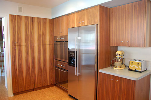 The ovens, refrigerator, and hood are Whirlpool for Ikea. I like the simple design of them and the price was nice especially with a great sale. The refrigerator is the
  I asked our designer to put legs on the wall cabinet-piece after seeing a photo from a 1960′s kitchen where the cabinet was raised with metal legs.
 My Mom made us the curtains. It was a hard choice because we love a very clean look. But everyone had curtains in the 60′s and they are warm and useful. I found the fabric at the same store that I found the orange vinyl. I love the linen look. It looks period-appropriate to me.
 We love the new cork floor. I think it’s the best material for a kitchen floor for standing, and because things don’t break when dropped (or thrown.) It’s beautiful and warm, even in the middle of the night, in the winter with bare feet. And I think it looks really nice in the entryway, too.
 From Rejuvenation, is the light I longed for. Thanks again to Pam, and this blog, I have what I think is the coolest light ever. Pam had a feature after visiting the Rejuvenation warehouse. Pam had
 The pulls are the
  After having the Ikea stovetop for a while, we sold it and bought an induction cooktop. Cleaning those gas stovetops is just too much of a pain for us and it wasn’t holding up well either. The GE cooktop is amazing, incredibly efficient, modern-looking, and cleaning it is a breeze. We highly recommend it.
 Eero Saarinen is amazing to me because of his tulip table and chairs, and the St. Louis Arch. I am so happy to have those works of art in my kitchen every day. And sitting on them is a joy. To me, there was no other table I could have. I found four Knoll Saarinen tulip chairs from 1973 on craigslist. They were structurally in good shape, there were no cracks, but the finish on them had worn through. And of course they looked their age. The cushions were ripped and scratched and looked awful. I had the idea to take them to an autobody shop since they are fiberglass. The shop in town did an excellent job repainting them. (I can’t believe I forgot to take before photos!!) Apparently, I ruined their resale value having them painted, but I won’t be selling them anyway. I had the cushions reupholstered in an orange vinyl as close, as we could see, to the “carrot” that Knoll still makes them in. I didn’t have the time or will to find a used table, and it was too hard to find the right size. Therefore, I bought the table new from Design Within Reach.
 The backsplash tile is from Ann Sacks. Keith and I saw it in Miami’s Design District, two years before we bought it, and took a photo just because we loved it. I didn’t think the day would actually come when I could USE it. I love that it’s designed by, and supports, an artist.
 I love my toaster. We vacillated about it for an entire year, I think. I just couldn’t stand how awful a lot of new toasters look. They just didn’t match. And, I didn’t want to buy anything made in China. My husband finally gave me the go-ahead to get one from
 Rebecca — you and your husband did an amazing job with this kitchen. I’m loving your bright orange accent wall. From the gorgeous cabinets to the special light fixture — you really nailed the 1960s Scandinavian look you were trying to achieve. Of course this kitchen will be everyone’s favorite spot in the house. Mega thanks for sharing your story and photos here — and for creating the awesome “retro” ad for Retro Renovation.
Because Rebecca’s kitchen was so fabulous — we’ve included the slide show below to show the photos twice as large as in this post.
Tips to view slide show: Click on first image… it will enlarge and you can also read my captions… move forward or back via arrows below the photo… you can start or stop at any image:?


The post Rebecca and Keith’s Mad Men kitchen remodel — and Mad Men ad designed for us! appeared first on Retro Renovation.