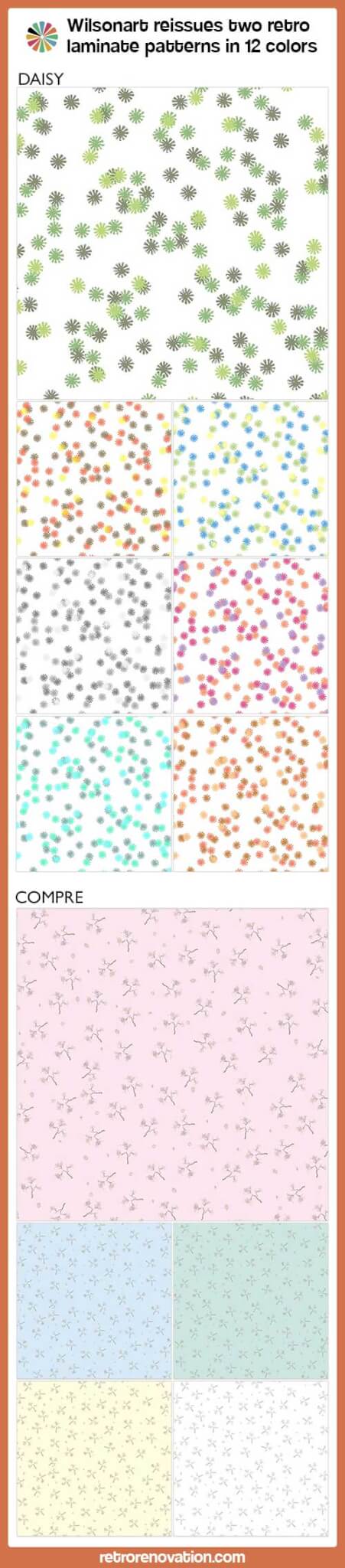
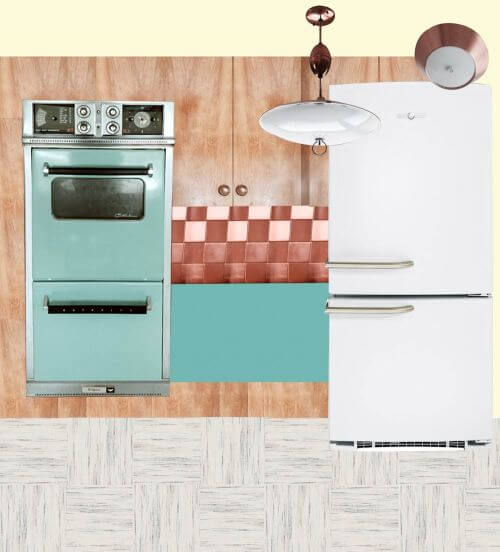
![retro laminate pattern]() Big news for retro laminate lovers — Wilsonart has revived two historic patterns from their archives: Compre from the 1960s — and Daisy from the 1970s. These designs come in 12 colorways, including several in original 60s and 70s hues. These retro revival laminate patterns are part of Wilsonart’s enlarged Virtual Design Library, which now contains some 150 unique designs produced via high-resolution digitally printing (vs. made with deco paper) available by special order. Use them for your retro kitchen countertop, bathroom countertop — or even, furniture!
Big news for retro laminate lovers — Wilsonart has revived two historic patterns from their archives: Compre from the 1960s — and Daisy from the 1970s. These designs come in 12 colorways, including several in original 60s and 70s hues. These retro revival laminate patterns are part of Wilsonart’s enlarged Virtual Design Library, which now contains some 150 unique designs produced via high-resolution digitally printing (vs. made with deco paper) available by special order. Use them for your retro kitchen countertop, bathroom countertop — or even, furniture!
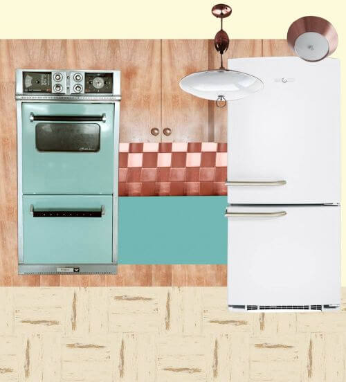
![retro laminate patterns]() Disclosure: Earlier this year I met with Wilsonart to discuss vintage laminates and laminates available today for midcentury style kitchens and bathrooms and ways we might be able to work together to get more vintage-style designs and colorways back on the market. While I was not involved specifically in the rollout of these designs shown today, I saw the original document prints, provided a few suggestions, and encouraged this effort. I continue to work with Wilsonart in this area and if any collaborative projects result, will disclose the blog’s involvement.
Disclosure: Earlier this year I met with Wilsonart to discuss vintage laminates and laminates available today for midcentury style kitchens and bathrooms and ways we might be able to work together to get more vintage-style designs and colorways back on the market. While I was not involved specifically in the rollout of these designs shown today, I saw the original document prints, provided a few suggestions, and encouraged this effort. I continue to work with Wilsonart in this area and if any collaborative projects result, will disclose the blog’s involvement.
Daisy laminate by Wilsonart — reproduction of a 1970s pattern
“Daisy is a design right out of our 1970’s archives. Popular in the early days of laminate, this smallscale graphic design has a random pattern of asterisks scattered on a white background,” Wilsonart says on their website. We sure like the look of this one, and can’t wait until we see the samples on their way to us.
We asked Natalia Smith, design manager at Wilsonart, about the colorways chosen — are they authentic, based on the original designs? She told us via email:
Envy Daisy, Apricot Glow Daisy, and Autumn Lights Daisy are very, very close to the chips in our archives. Tropical Daisy, Field Daisy, and Wintergreen Daisy were inspired by the colors of the 1960’s and 70’s. I actually did a search on Pinterest for fashion of the 60’s and 70’s and some really fun things popped up. Field Daisy was inspired by a crochet dress pattern from the 60’s! Of course, we needed the Ice Daisy to satisfy the group who love black and white. It’s actually interesting to see it in grey scale; it takes on more of the asterisk look than a daisy.
The scale of the pattern — the daisies and the way they are sprinkled about — are also close to the original.
Hey: Click on any of these photos — and they will enlarge on screen, so that you can see more of the detail.
![retro laminate pattern]()
Envy Daisy – pattern of lime, olive and pine asterisks scattered on a white background. Color: Very close to the original design.
![retro laminate pattern]()
Apricot Glow Daisy – pattern of tan, coral, and brick asterisks scattered on a white background. Color: Very close to the original design.
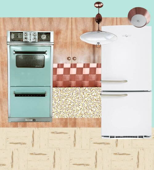
![retro laminate pattern]()
Autumn Lights Daisy – pattern of yellow, orange, and brown asterisks scattered on a white background. Color: Very close to the original design.
![retro laminate pattern]()
Tropical Daisy — pattern of pink, orange and purple asterisks scattered on a white background.
![retro laminate pattern]()
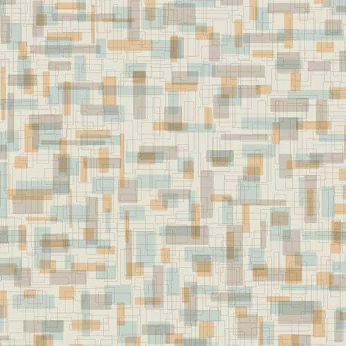
Field Daisy — pattern of yellow, blue, and green asterisks scattered on a white background.
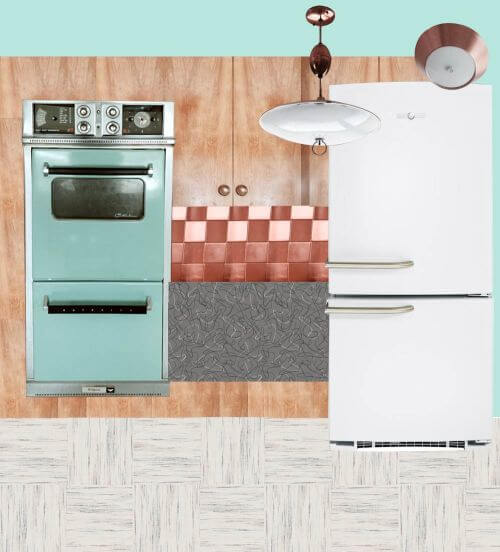
![retro laminate pattern]()
Ice Daisy — pattern of silver, taupe and battleship grey asterisks scattered on a white background.
![retro laminate pattern]()
Wintergreen Daisy – pattern of mint green, aqua blue, and pewter scattered on a white background.
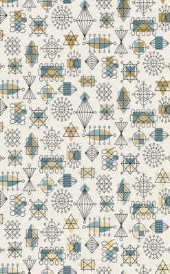
Compre laminate by Wilsonart — reproduction of a 1960s pattern
“Compre are designs right out of our 1960’s archives,” Wilsonart said, “It is a medium-scale retro pattern featuring abstract botanical designs of stylized trees on select backgrounds.”
Regarding the colorways, Smith told us,
In regards to the Compre design, from what we can tell, the design was on an overlay and paired with our solid colors of the time. Think Gold Lame or Glitter. Glitter was an overlay paired with solid color papers. Our Compre designs today are printed which allowed us to get as close as possible to original colors, but not exact. It is very difficult to match a printed color to a solid color paper that is made from a color slurry.
![retro laminate pattern]()
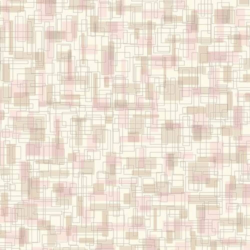
Pink Compre — with a pale pink background.
![retro laminate pattern]()
Cadet Compre – a pale blue-grey background.
![retro laminate pattern]()
White Compre — a white background.
![retro laminate pattern]()
Yellow Compre — a yellow background.
![retro laminate pattern]()
Mint Compre — a pale mint green background.
Full text of our Q&A with Natalia Smith, design manager for Wilsonart:
Q. Are new patterns exact replicas of the originals?
As close as possible. In the case of Daisy, the scale is the same. In the case of Compre, the scale is slightly smaller.
Q. If not, why did you decide to change the patterns in scale/pattern?
In both cases, we did not have a lot of original material in order to be completely faithful to the original scale/pattern. We’re talking just chips. We had a lot more Daisy chips which made it a little easier to piece together. With Compre, we have even fewer chips. We were actually quite jazzed with the idea that we were “rewriting” history. We gathered the information we did have, and attempted to create a design that looks authentic.
Q. Are some of the colorways exact replicas? If not, how did you choose the new color ways?
For some, as close as possible, for the rest we really were inspired by the era and had fun experimenting with color. Envy Daisy, Apricot Glow Daisy, and Autumn Lights Daisy are very, very close to the chips in our archives. Tropical Daisy, Field Daisy, and Wintergreen Daisy were inspired by the colors of the 1960’s and 70’s. I actually did a search on Pinterest for fashion of the 60’s and 70’s and some really fun things popped up. Field Daisy was inspired by a crochet dress pattern from the 60’s! Of course, we needed the Ice Daisy to satisfy the group who love black and white. It’s actually interesting to see it in grey scale; it takes on more of the asterisk look than a daisy.
In regards to the Compre design, from what we can tell, the design was on an overlay and paired with our solid colors of the time. Think Gold Lame or Glitter. Glitter was an overlay paired with solid color papers. Our Compre designs today are printed which allowed us to get as close as possible to original colors, but not exact. It is very difficult to match a printed color to a solid color paper that is made from a color slurry.
Where to order Wilsonart Daisy and Compre vintage design laminate
Anyone can order 8″ x 10″ samples via Wilsonart’s website.
We also wanted to know whether consumers can order laminate directly from Wilsonart. In short — no — but you can order through normal retail channels. Marketing elaborated in response to our question:
I don’t think we can support customers calling us directly to order – at least not at this stage. On the other hand, they’ve always been able to order these products through a designer, a distributor or through the home centers.a consumer can order the VDL designs through Home Depot and Lowe’s.
The complete Wilsonart news release:
Wilsonart Expands Design Library with 150 New Designs
A Whole New World of Pattern is Just a Click Away
TEMPLE, TX (November 4, 2014) – For centuries, designers have searched for more design choices – in fabrics, wallcoverings, furnishings, and no less so, in laminates. Now Wilsonart has an answer – but it’s not on the wallboard, it’s online.
A leading manufacturer of decorative surfaces for more than 50 years, Wilsonart responds to the designers cry for more with 150 new designs, all available as part of a Virtual Design Library (www.wilsonart.com/VDL), an evolving, curated collection of laminates available in just 2-3 weeks from order.
“We’re already used to finding more products, more conveniently online in our personal lives,” said Gwen Petter, director of surface design at Wilsonart. “We thought ‘why not offer that same flexibility and easy access for laminate?’ So we started with a range of designs, some whimsical, some trendy, and some larger scale that really reposition laminate. Our long-range plan is to grow this ‘extended design offering’ to literally thousands of designs.”
The expanded design library was developed with two guiding factors: make it different and make it easy. “We make it different,” says Petter, “by sourcing designs from artists, from trends and even from photographic real life images. We make it easy by doing all the work for you. Unlike “custom” programs, our graphic designers have done all the work ahead of time – the color matching, layout and image adjustment. You get more without having to do more. We think that’s what designers really want.”
By visiting www.Wilsonart.com/VDL designers can access this curated library with patterns ranging from photorealistic imagery such as food and floral patterns to abstract and artistic graphics that subtly set a mood. Think color and bold graphics. Think fun with artistic flair. Those are the themes of the first iteration of designs to join the expanded Wilsonart® Laminate collection.
“It’s like that magical moment when music lovers discovered iTunes,” remarked Natalia Smith, design manager at Wilsonart. “Designers can begin to have access to design selection that will continue to grow and evolve with year-round additions from our design team, as well as emerging artists, illustrators, and designers we’ve sourced from around the globe.”
The first 150 designs fall into 9 themed collections: Geometrics, Folk Art, Retro, Sports, Woodgrains, Youthful, Study Hall, Delectable and Nature. Wilsonart plans to expand the online library with additional collections throughout 2015 and beyond. Many of the curated patterns in this collection are also available in broad colorways, providing even more choice and inspiration.
“Take Geometrics, for example,” says Smith. “They are a great way of adding interest in a trend-savvy way. So much of what we see today is a skillful, yet casual mix of ideas and color. You can have a space where historical, time-worn features form a backdrop for an eclectic mixture of flea market finds and bold pops of large-scale color and pattern.”
Selection is one thing. But what about delivery? Wilsonart’s new offer comes with speedy turn-around on everything – just 2-3 weeks from factory to fabricator. Samples are readily available online at www.wilsonart.com/VDL or through Wilsonart’s stellar Customer Service Center at 800-433-3222.
Don’t forget, Wilsonart also offers retro boomerangs as part of this collection, which we’ve covered before, too.
This is beyond exciting folks! Kate and I have requested samples already so we can see these fabulous new options in person — we’ll surely be back with more about these fun new patterns!
Link love:
The post Wilsonart reissues two vintage laminate designs from the 1960s and 1970s — Daisy and Compre — 12 colors appeared first on Retro Renovation.
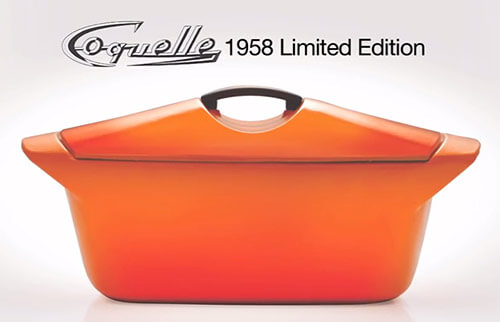 We’re already groupies of famed industrial designer Raymond Loewy, so how wonderful that Le Creuset is offering a limited edition reissue of the Coquelle — the cast iron dutch oven that he designed for the company in 1958. Mega thanks to reader Saundra for the tip!
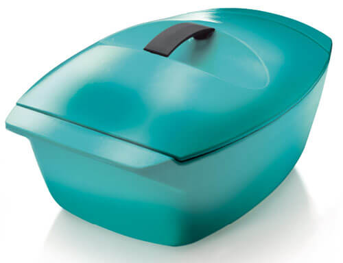 Le Creuset is offering two vibrant colors of the sleek, oven to table design — a bright reddish orange called flame and turquoise. The reissued Coquelle retails for $375, which is spendy for sure, but golly — a fresh chance to own a simply gorgeous and well designed piece of kitchen history. Pam says she has a couple of pieces of Le Creuset — gifts from her Mom, who is a fan of the brand — and both Kueber women like them a lot, especially for slow cooking navy bean soup and beef stews and other winter comfort foods yummy in the tummy. (They are also both #1 fans of cooking with vintage Club Aluminum.)
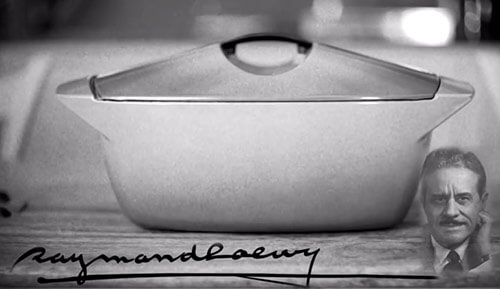 Loewy was the most influential industrial designer of the post-war era — designing products ranging from home goods like furniture and kitchenwares, packaging and logo design, industrial designs for trains, cars and other transportation. See his career highlights — and lookie that client list! — here.


 . (affiliate link)
 (affiliate link). It took quite a bit of trial and error as the color I was trying to achieve was teal … not blue, not green, not turquoise, teal! I was trying to match the original tile sizzle stick in my kitchen’s backsplash. I started by practicing with colors I didn’t care for, with the most inexpensive craft glitter, then went into the teal attempts. By the time I was done, I had more than 100 extras! Did I mention I am obsessed with atomic starbursts? Yeah.


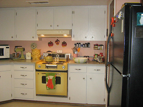
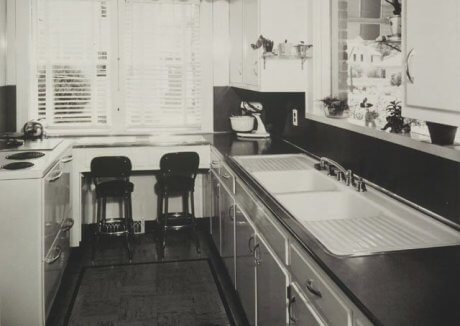
 As we like to say here, “There’s more than one way to retro.” This circa-1974 St. Charles Kitchens catalog — just added to my personal collection — proves it, yet again. St. Charles trots out their interior design experts and shows one harvest gold kitchen … decorated in six different styles of the day. From Early American to Mediterranean to 70s Contemporary — and more — they show us how to get our 70s style cookin’.


 Above:
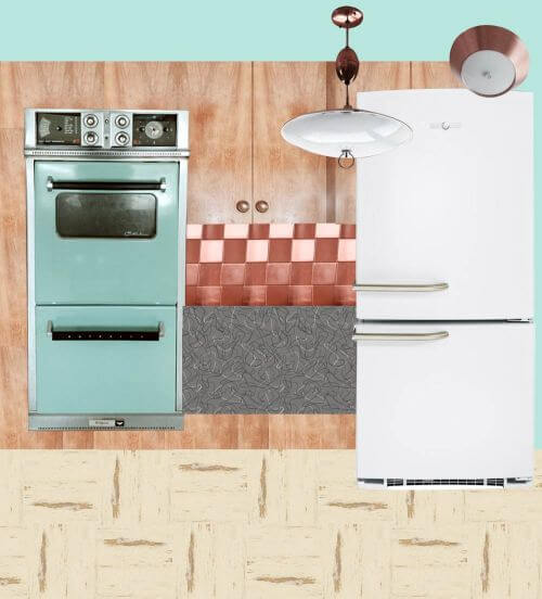
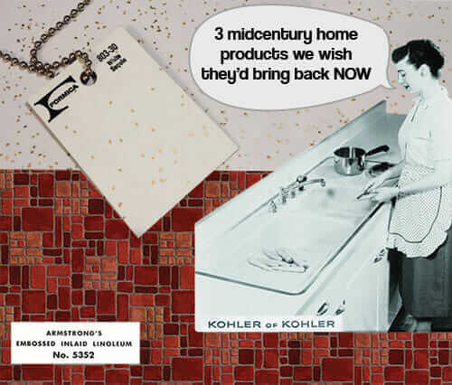
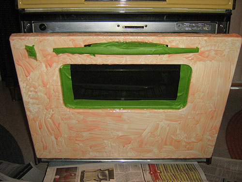
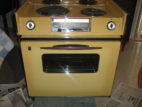
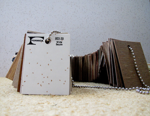
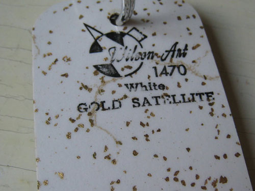
 The absolutely positively #1 item on my list is glitter laminate. Made with deco paper — with real glitter inclusions, just like they were starting around 1950 all the way through the early 2000s — yes, this stuff was available for more than 50 years, non-stop.
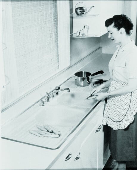


 ” (*affiliate link) years — a term invented by author Thomas Hine. Beginning around 1953 and running through 1963, colors and designs in America became more exuberant, more experimental; these were heyday years for America in a variety of ways, and our rising affluence was communicated in our interior design and architecture.